


SPRING 2025
Poppy | Face Care Beauty Brand
While working as an intern at Kao in Cincinnati, OH, I was introduced to a “Co-Op Special Project,” which allows interns to create their own beauty brands and experience the process from concept to final product comps. The brief entailed creating a brand suited for the Gen-Z consumers while also having environmental, health, or safety benefits.
Having dry, sensitive skin myself, it’s hard to find the right products that are easy to understand. I wanted to create an easy, step-by-step skin care routine product line for people like me, looking for something simple, effective, and fun!

Brand Story
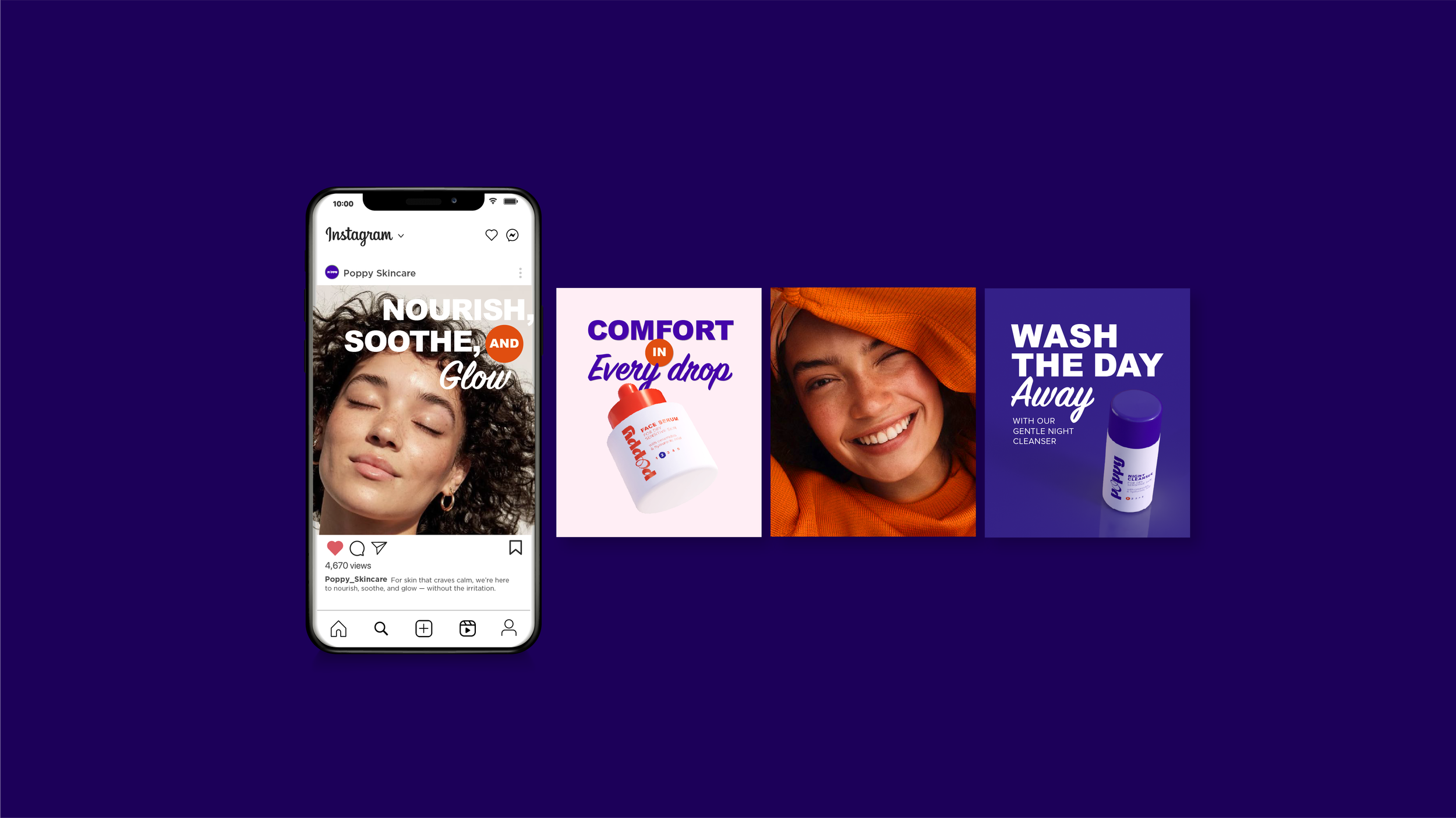
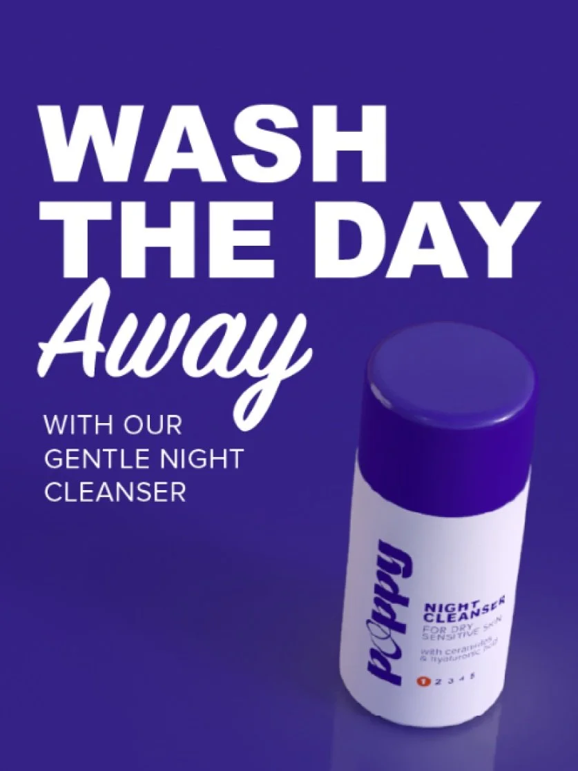
At Poppy, we know that real beauty starts with healthy, glowing skin. That’s why we’ve created a collection of face care essentials designed specifically for dry and sensitive skin. Made with pure, natural ingredients, our products work in harmony with your skin to restore, hydrate, and protect, so you feel confident in your natural beauty every single day.
With hypoallergenic, clean, and cruelty-free ingredients, our formulas are gentle yet effective, treating your skin with the care it deserves. It’s time to nourish your skin, embrace your unique beauty, and let your natural radiance flourish effortlessly.

MOODBOARD
Looking at some Gen-Z trends, brands tend to be more colorful and type-heavy. I was inspired by some funky type pairings that feel bold but gentle.

NAMING
Criteria for the name included: having a natural connotation (plants, flowers, etc), quirkiness, being gender-neutral, and inviting. I started by generating some cute names that also meant beauty & growth, giving it some personality.

LOGO ITERATIONS
I landed on the name “Poppy”, symbolizing peace, remembrance, and delicate beauty.

PACKAGING CONCEPTS
I started by trying different bottle shapes, textures, logo orientations, and colors. A vertical logo felt most relevant to Gen-Z consumers based on recent trends

COLOR ITERATIONS
By adding in other products, it became clear that there should be a visual system indicating either the night/day use or the progression of application.
PRODUCT LINEUP
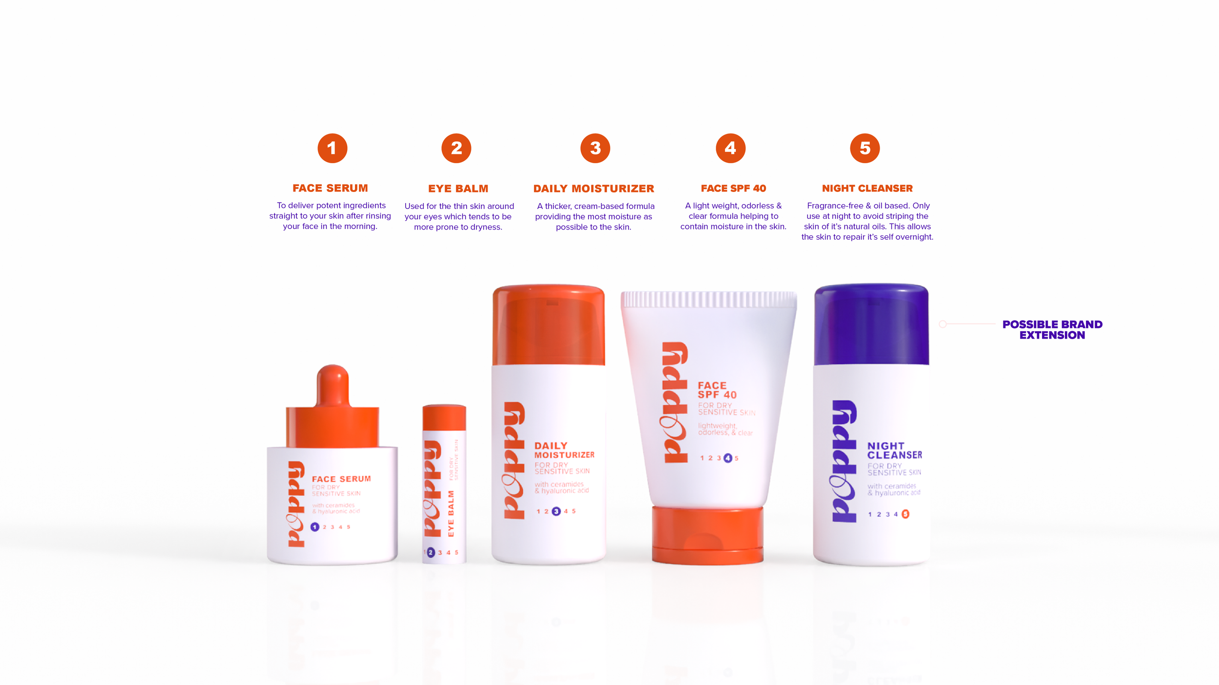

DESIGN INTENT

COMPING PROCESS
Special thanks to 3D Color for their support, guidance, & materials used in crafting detailed compositions for the many Co-Ops that come in and out of Kao.