SUMMER 2023
RedRoots Festival | “RedHead Days” Rebrand
RedRoots is a fictional graphic identity built for the national “Redhead Days Festival” located in Tilburg, Netherlands. Being a redhead myself, this was one of the first festival that came to mind when tasked with redesigning a festival’s brand identity for a semester long graphic design project.
This new brand identity has a compelling visual system built to drive those interested, redheads or not, to a unique festival experience. It displays a social and environmental tone by using a visual system created to resonate and excite those who attend.

Festival Origin
The “Redhead Days” festival, located in Tilburg, Netherlands, is an annual gathering of tens of thousands of people, including many thousands of redheads from over 80 countries. It is the oldest, largest, and most spectacular redhead festival in the world.
It all started in 2005, Bart Rouwenhorst was preparing an exhibition in Asten, looking for 15 red-haired models and instead got 150! He offered all the models to come together in Asten and take a group photo. The meeting was remarkable! Many redheads asked Bart to organize a second meeting, which was attended by more than 500 redheads. Today the festival grows more and more every year!

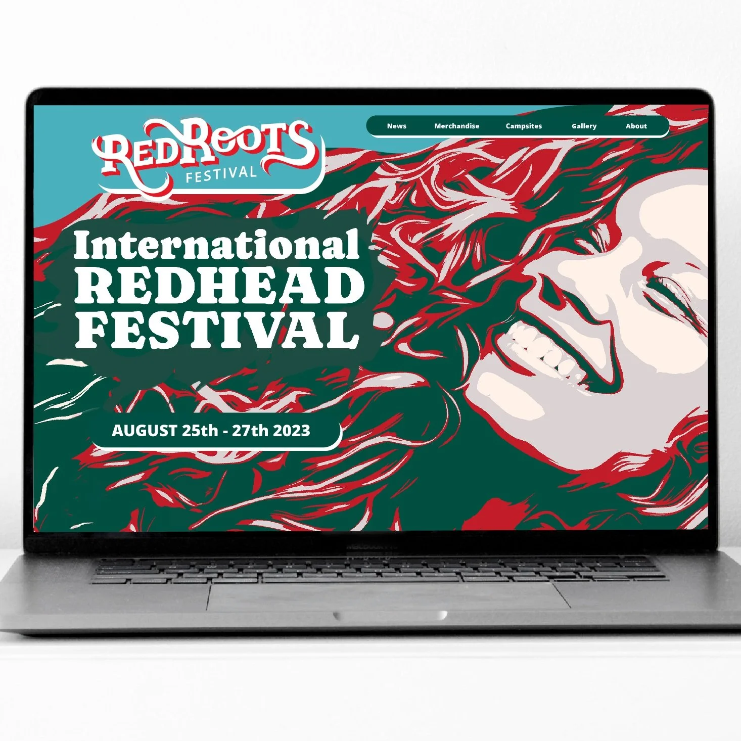
CURRENT VISUAL IDENTITY
The current visual identity had some disconnect in the way they were being represented. Being a part of the redhead community, I naturally wanted to give this festival a fresh rebrand that corresponds with their activities & core values: Pride, Recognition, & Connection.

SKETCHES

DIGITAL ITERATIONS
Going with a wordmark logo type to put emphasis on the name, I experimented with how the letters should interact with each other, symbolizing the movement of hair.

COLOR STUDIES
I kept running into a familiar look and feel that other popular logo marks have done before. The color combination that stood out from the others was the teal blue for it’s uniqueness and bright red for it’s subtlety.

Brand Identity
When reimagining the festival’s brand identity, it was important to preserve the rustic charm and playful spirit of the festival while enhancing its visual appeal. The challenge was figuring out a way to transfer the whimsical, rustic feel that the new logo offered into a visual experience for guests.
To accomplish this, I experimented with handcrafted textures & image effects that resonate with the playful, rustic charm of the events and activities offered at the current festival. Through bold typography, an earthy color palette, and subtle textures & patterns, I crafted a cohesive identity that honors the brand's roots while positioning it for future growth.

PATTERN EXPLORATION
Only a handful of handmade pattern techniques I’ve tried. Too many of which were feeling less playful and more… deadly? I started to realize bright Blood Red was not the correct color to lead with…

IDENTITY IDEAS
What I found most difficult was incorporating the fun, flowing feel from the logo mark into the rest of the brand identity

IMAGE EFFECTS
After experimenting with many different image distortion techniques, I discovered an ink-style overlay tool that finally started to feel personal, rustic, & playful like the aesthetic this festival offers